Kitchen white gloss sea wave. Turquoise kitchen design - selection of a harmonic palette, arrangement tips, photo ideas
He is able to recreate an unobtrusive, good-natured, comfortable atmosphere in the room, conducive to a pleasant meal with the family.
Features of using turquoise
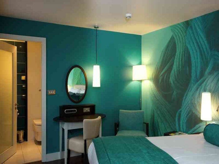
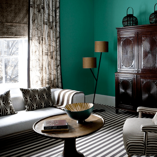
The photo shows a turquoise kitchen in a Scandinavian style.
The cool, fresh, invigorating color of the ocean is very suitable for a south-facing kitchen. Even in the scorching summer heat, it will create the illusion of a fresh sea breeze.

For rooms located in the north, this shade of a cold palette should be used carefully.
The tone changes its properties in accordance with the lighting, and in a dark kitchen it can appear too cold and stern, not at all conducive to the appearance of appetite.

Don't forget to highlight the turquoise with cool LED lighting, which will reveal its beauty. Yellow lighting will not work at all. The versatility of turquoise is manifested in combination with other harmonizing or contrasting shades.
A color scheme
From snow white to gray. When renovating a room, using white finishes in combination with bright turquoise furniture is very effective and successful.
This interior is reminiscent of the open spaces of the sea, white sails and the serenity of the sun at its zenith, reflected in the waves.
Peace and tranquility will reign in a white and turquoise kitchen. Gray colors give a slightly more subdued effect. They can be a backdrop for bright furniture or decorative elements.


From honey to terracotta. All warm shades of red color interact productively: honey, golden, ocher, sand, terracotta and copper.
These colors can be used for flooring and wall decoration in combination with bright marine-colored furniture, and vice versa.
A light, almost faded mint tone can be used to decorate rooms in which wooden furniture in the color of golden oak, with original decorative dishes made of brass or copper, will occupy a favorable place.
A third option is also possible, when two colors will be dominant. For example, terracotta and dark turquoise on a pastel background will give an impressive ensemble.


From baby blue to indigo. The self-sufficiency of the color scheme is manifested in its ability to create stunning monochrome ensembles. Interiors in blue-mint and azure-turquoise tones also look rich and bright.
The blue tone gives the interior austerity; it can be used for textile kitchen decor.
The azure glossy facades of kitchen furniture against the background of delicate pastel shades of sea wave will create a joyful and active atmosphere. But it is worth noting that it is better to complement monochrome combinations with small contrasting details that will please the eye.


From light brown to wenge. The combination of deep brown and light turquoise looks luxurious, elegant and rich.
This combination can be used for the main range of the room, taking it as a basis for furniture facades, textile decor, and flooring.
Beige color is used for floors, sometimes for wall decoration. It fills the room with the missing warmth. You can add turquoise details to a creamy beige kitchen for a slight fresh effect.


From light green to dark green A combination with all shades of green will look fresh and stylish in spring.


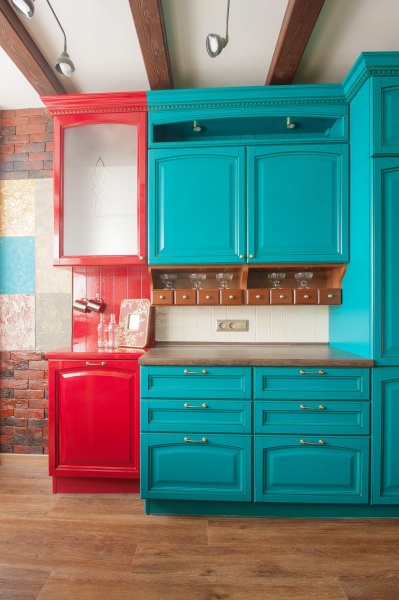
Red shades. Bright red color looks contrasting in a composition with turquoise. 


Use in various interior styles
Timeless classic. Pomp, some solemnity and coldness, reminiscent of the decor of palace halls, are inherent in the classic interior in turquoise colors.
The use of geometric patterns, ornaments and monograms on the surfaces of furniture and walls in this style will look quite appropriate. The classics are emphasized by gold or bronze used for door handles, dishes and decorative items.


Country flavor. The characteristic rich shades and rich colors allow you to use color to the maximum.
Curtains, upholstered furniture, decorative pillows, lamps - all this can have different shades of turquoise, combining with similar and contrasting colors in fancy patterns.


Frosty freshness of modern times. Glamorous modernism, sophisticated shabi-chic, laconic minimalism are also good for using frosty color.
For modernism, bright colors in combination with red, yellow, bright green or purple are suitable; To create a kitchen interior in a retro or shabby chic style, you can use the faded, palest shade of color.
Turquoise in combination with chrome and metal can become the basis of a high-tech room. You need to approach it very carefully.


When renovating a kitchen in one of the styles, do not be afraid to use the freshest, most sophisticated and multifaceted shade of the palette. Even if these are only small details, textile or decorative elements, they will make your kitchen unique.
Turquoise color, both rich and light, is equally suitable for kitchen interior design. You can also use sea green color in your design.
The refreshing and noble turquoise color for the kitchen is unforgivably rarely chosen, although furniture designers seem to simply adore it. The reason is that a cold tone is not so easy to fit into the interior, and any mistake makes the airy shade become heavier.
Features of turquoise color
Like all cool shades in the interior, sea green visually expands the space. But only when there is enough warm light in the kitchen. If the windows face south or east, natural insolation may be sufficient. Otherwise, you will need to organize good halogen lighting in the warm spectrum along the entire contour of the kitchen.
The rich turquoise color, like the semi-precious stone that gives it its name, always looks luxurious. It emphasizes cleanliness and lightness, but not the coziness of a home, but it perfectly “cools” the room in the heat.
Turquoise is a known plagiarist. He changes before our eyes when he finds himself in the company of brighter colors:
- pure blue tone saturates turquoise with depth;
- fresh green “repaints” the color of sea wave;
- white makes you play brighter;
- yellow fills with sunlight.
When decorating a kitchen in blue and green tones, it is better to limit yourself to the work area. For those sitting at the dinner table, an excess of this shade can reduce appetite.

A win-win combination
Turquoise needs to be diluted with other colors and elegant patterns - monochrome in a pale blue design looks too prim for a home interior.
The kitchen walls, made in turquoise, beautifully set off the white furniture, turning even a small room into a seemingly endless expanse of sea. To restore intimacy and a sense of coziness, you can choose warm brown, honey and beige colors as a counterbalance to the main tone.
Golden decor or natural wood in accessories will help to “domesticate” turquoise. But as a bright accent, he himself can revive a sleepy interior in pastel colors.
The color of the sea wave goes well with related shades from the yellow-green range: mustard, pistachio, olive. It is important that they all have similar properties (intensity, saturation, gloss effects or depth).

Three main "don'ts"
There are strict restrictions when decorating kitchens using turquoise tones, which only people with developed taste and a sense of harmony can bypass:
- You shouldn’t “set fire” to a cold interior with bright red elements. Such a bold contrast if the proportions are not respected will make the atmosphere aggressive and tiring.
- Green-blue paints should not be used on the ceiling. Most likely, instead of the feeling of a clear sky above your head, you will get frightening sea waves that are about to crash from above.
- Don't let turquoise dominate everything. It should be present on equal terms with other paints. Still, the capricious color is intended to decorate and refresh a boring space, and not to subjugate it.
But a blue-green floor covering will be appropriate and will definitely lift your spirits.
Turquoise styles
- New wave (new wave) is a way to make the turquoise color warmer due to even cooler shades in the interior.
Lemon, pink and matte black colors can dilute the palette, but they need to be used in doses, without overloading the space and only emphasizing some design details with their help. All lines must be subject to the laws of two-dimensional graphics, so simple furniture in a minimalist style and an almost complete absence of accessories will be the right choice.

- Country style seems to be specially created for turquoise shades.
It contains everything you need to harmoniously fit this color into the interior of the kitchen. Wooden furniture and plank floors, “rustic” floral textiles and the homely warm light of lamps are ideally combined with turquoise paint.
- The idea lying on the surface is .
A yellow floor covering that imitates a sandy beach or a sunny mosaic panel on the wall is perfect for its implementation. The picture will be completed with light wood furniture, bright fabrics and indoor plants. This style opens the way to bold experiments: let it be blue waves “painted” on the wall with a combined finish, stone countertops and an apron in the work area, or decorative pebbles in transparent vases.
- The Russian field is a rather rare way to play up the exquisite turquoise color.
The overall goal is the same - to bring the warmth of sunny summer into the kitchen. To achieve the desired effect, you will have to remember the requirements of minimalist design: simple functional furniture with laconic forms and without excess decor. A lively shade of green foliage in the interior and a snow-white ceiling instead of clouds will help.

Interior design in blue tones will make your kitchen a corner of calm in the fast pace of life. After all, blue is the color of water, a symbol of peace. In addition, blue color increases appetite, creates a pleasant atmosphere, and encourages communication. And, which is very important for our small apartments, it visually expands the room.
Blue is combined with wooden parts of any brown shade, except the darkest. Don’t worry, order a set made from wood or solid wood - it will fit perfectly. Stone will also look good in a blue interior - you can safely order a stone countertop or. The trend is checkered textiles (blue and white check), sea wave, a combination of turquoise and coral, white dishes.
Choose lamps for lamps with neutral or warm light. The cold bluish glow combined with turquoise walls and gray curtains will simply freeze you in the evening.
South or north?
Which side do your windows face? If the kitchen has a lot of sunlight, then the room can be left in cool colors, combining blue or sea colors with white. White will give your kitchen extra freshness and cleanliness. But if there is not enough light in the room, then it is better to choose a warm companion color: yellow, orange or coral.
In the photo - with white. Combine all shades of wave and add an abundance of white, and then you will get a reminder of the sea.

 In this photo, a little warm color has been added - beige. If you want colors that are not too bright, like yellow or not too cold, like a combination of white and blue, choose beige and colors close to it: cream, vanilla, peach, sand, coffee.

 The next photo shows warm shades that match blue. Adding coral or pink will make the interior cozier. In this color you can order both a set or an apron, as well as small accessories: paintings, vases, curtains. Add more shades of blue: sea wave, turquoise, cornflower blue, gray.
 In the photo below you can see that yellow harmonizes just as well with blue in the interior. Remember a simple rule: the more saturated the companion colors, the finer the details in which they are present. If you don’t have enough sun indoors, then a yellow tone will compensate for its deficiency better than others. Add a few more tones of yellow: sand, cream, vanilla, and also shades of blue: ultramarine, sea wave, metallic.
 The next photo clearly shows how well bright colors, such as orange and blue, set off blue. In the interior, you can combine not only pale blue, but also blue, aqua or turquoise with these colors.

The main rule when choosing in favor of brightness: do not overdo it! Don't want to get a parrot kitchen? Then highlight a few details, for example, a pattern on the apron (red flowers), or on the curtains (red poppies) or on the wallpaper (orange tulips), a magnet on the refrigerator, a flower pot. But don't paint entire walls orange, or use red curtains or a yellow splashback.
Neutral companions
What if you don’t want to dilute your favorite blue color with anything? But decorating your kitchen only in blue colors is not an option for you. Then use neutral colors: gray or beige. These colors will not compete with the main tone and will not attract undue attention like bright or contrasting shades. See the results in the following photos.
By the way, advice on choosing household appliances: any color (gray, white or beige) will do, except black. 
 If gray color leads us to cold shades, then beige leads us to warm ones. Choose what you like best (don't forget about the location of the windows and the amount of sunlight).

Closer to nature
What kind of flooring are you thinking of putting in your new blue kitchen? The first thing that comes to mind when you hear the word “floor” is brown, light brown, gray. Maybe it's worth a try? And in general, maybe add more greens? You will get a completely different effect: a green meadow under a blue sky. And if you enter yellow, then under a sunny sky. Look how well these colors go together:

 But here's a more intense one:
 Whatever shades of the kitchen interior you choose, do not listen to the numerous tips that will fall out of a cornucopia as soon as you tell others that you are going to start decorating your kitchen. Trust yourself and your family, because you should feel comfortable in the kitchen.
A few years ago, deep shades of blue were very popular in clothing and accessories; all fashion catwalks were full of turquoise and azure. Today, the sea green color is in great demand in the interior; all designers in the world, to one degree or another, use this shade in their projects.
Sea wave harmonizes with many shades, easily fits into any interior, and can be used to decorate different rooms. But this color also has its own difficulties that you definitely need to know about.

What colors does sea green go with, in what combinations is this shade most advantageous, and how to use it correctly in interiors - the answers to these questions can be found in the article. Photos of the most successful interiors, decorated in the colors of the sea, will also be shown here.
Features of aqua color
This shade is intermediate and is in the middle of the blue-green spectrum. If the famous turquoise contains blue and green colors, then to get a sea wave, you need to dilute the green with blue. Different sea wave tones are obtained by mixing different proportions of these standard colors (blue and green), as well as adding one or another proportion of white.
Another name for sea wave is cyan. It is a deep, rich blue-green color that is associated with the hue of the sea during a thunderstorm. There are also lighter and more cheerful sea wave tones; in the line of these shades you can even find warm and fairly calm colors.
As a rule, a range of shades from the cyan group is used to create marine interiors. The sea wave is no less popular in Mediterranean designs; it is successfully used in classic interiors, diluted with gold or beige.
Attention! The aqua color is quite universal. It is suitable for absolutely any design: from classic to modern minimalism, from Mediterranean style to light Provence. You just need to choose the right cyan tone.

The influence of color on the nervous system and the general condition of the human body has been proven for a long time. Psychologists say that shades such as cyan are chosen by people who are strong, purposeful, and who love adventure and travel. Tones from this range relax, but at the same time, cyan stimulates the nervous system, forcing a person to accumulate energy and direct it in the right direction.
Therefore, the color of the deep sea can be used in any room of your home: from the bedroom to the office or bathroom. The only thing that needs to be taken into account when decorating a room in this tone is that there should not be too much of it; in extreme cases, muted, calm shades of sea wave should be chosen as the dominant one.

What colors does sea wave go with?
Finding a “companion” for cyan will not be difficult; this shade goes well with almost all standard colors. It is much more important to set priorities correctly, skillfully use bright spots, color accents, and calculate the proportions of a particular color.

Proven combinations of sea wave that will surely fit perfectly into the interior:
- Sea wave + gold. This is a standard combination that is often used by designers when creating classic interiors. Gold embossing on dark turquoise curtains or wallpaper looks very advantageous. Any decoration in the form of a border, pattern or pattern will also fit perfectly into the interior.

- Cyan + beige. If golden tones are too bold a decision, then they can easily be replaced with warm beige tones. This combination will not be colorful and bright, it will turn out more gentle and calm. A room in turquoise and beige colors will become lighter and create a warm and cozy atmosphere.

- Sea wave combined with white. If you mix cyan with white shades, then it is better to choose the brightest of them: snow-white and the color of sterility. The sea wave itself can have different tones: from the lightest shade to the deep, almost gray color of the sea depths or stormy sky. Such an interior will be strict, with clearly defined lines; it will promote order and will in no way be able to harmonize with chaos.

- The combination of cyan and black is a controversial solution, but it has the right to life. In this case, it is recommended to choose the lightest and most cheerful colors from the cyan range so that the interior does not turn out to be too gloomy and dark. It is better to use black in details, without allowing too much of them.

- The combination of colors from the aqua palette with any shades of red and yellow is a win-win option. You can use both warm tones, such as peach, lemon, orange or coral, and cooler ones, such as burgundy, burgundy, lime. Blue-green and red-yellow colors can be equal partners in the interior, or you can use them as accents in a monochromatic room in beige, white or gray.

- Purple and green colors go well with cyan, you just need to choose the right proportion. Such combinations are acceptable in oriental interiors, where it is customary to use deep and rich shades. Bright and rich tones of purple and green look best; they are usually used in numerous accessories and decorative elements of oriental interiors.

- Sea wave combined with brown color will organize any space. This is a great option for living rooms, bedrooms and offices. The brown shade should be warm and soft, then it will create an atmosphere of home comfort and warmth. Cool shades, such as dark chocolate or wenge, also look impressive, but it is better not to lift brown colors to the top - let them decorate the floor, the lower part of the furniture or the baseboard.
- Turquoise colors combined with pink shades may seem too bold a decision. In fact, cyan goes well with both the cold tones of pink and its warm shades, such as peach. This tandem is an effective solution for the interior of a children's room, which is intended for a little girl or teenager.
Important! Some psychologists argue that blue-green tones contribute to the development of excessive pride, can cause apathy and lead a person into a state of despondency. Therefore, you need to use shades of sea wave sparingly, and combine them correctly.
Sea wave color in the interior of different rooms
Many people like deep cyan; this color is often chosen to decorate different rooms in city apartments and private cottages. A room made in shades of sea green looks like it is immersed in partial shade. Such interiors are always cool and cozy, they are conducive to rest and relaxation.

Deciding what the marine color scheme will be combined with will become much easier if you answer two questions:
- For what room is the interior designed?
- What style has been chosen for the new design.
As already mentioned, sea green color is suitable for almost all styles, you just need to choose the right shade. As for the purpose of the room, everything is somewhat more complicated here - you will have to work hard to select suitable “companions” and correctly group the entire composition.
Kitchen in sea green color
Shades like cyan go well with natural wood, its warmth and texture. Therefore, kitchens that use wooden furniture, floors, ceiling beams along with facades or textiles in sea green color look very impressive.
You can also paint the walls in this deep shade, but keep in mind that northern rooms may look too gloomy in this color scheme. In combination with white, you can create a beach house atmosphere or use sea waves in Gzhel-style tiles or accessories.
Attention! Blue-green tones can reduce appetite, so they are recommended for those who want to lose weight. Also, in such a kitchen, blood pressure normalizes, a person calms down and relaxes.
Decorating a living room with cyan
The basis of a cheerful interior in the Greek style is white walls, columns, wooden beams and furniture, as well as green plants in tubs and pots. The sea green color suits all this perfectly.
If you decide to paint the walls cyan, it is better to enlarge the windows in the living room so that they let in more light and the room does not seem gloomy. The sea wave looks great in accessories: paintings and wall panels, decor, sofa cushions, curtains or carpets.

Advice! To lift your mood, you need to add yellow or light green details - this will make the living room cheerful and homely.
Sea depths in the bedroom
The blue-green palette is indicated for those who sleep poorly, who cannot calm down for a long time after a difficult day and get ready for sleep. To prevent a cyan-colored bedroom from seeming too gloomy, it is recommended to dilute the interior with orange, beige or brown tones.
Very often in bedrooms, designers use a cool mint shade, which is also part of the blue-green palette. This tone goes well with white or soft beige, evoking a feeling of peace and tranquility.
Attention! Those who are depressed and depressed should not choose dark cyan tones.
Deep blue colors are more suitable for sanguine people, cheerful and self-confident. For other people, calmer and lighter shades of sea wave are recommended.
Marine style bathroom
First of all, blue-green colors began to be used in bathrooms. But this does not mean that turquoise has already become boring - cyan can be a very interesting solution in the interior of a bathroom.
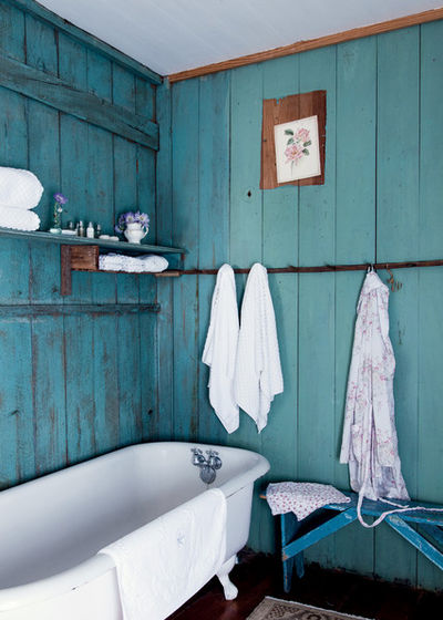
Walls painted in blue-green shades will be the perfect backdrop for the shells and pebbles collected on vacation. A bathroom in this style will remind you of relaxation, the sea and warm summer.
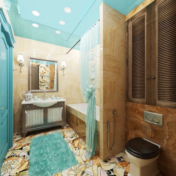
Suitable “companions” for the dominant cyan are white and beige, the color of sand, natural wood, warm shades of yellow and orange.
conclusions
Photos of finished interiors, the design of which used shades of sea wave, will not leave anyone indifferent. You can’t help but like this deep range, because the sea fascinates, draws you into an unknown abyss and promises extraordinary adventures.
To make the interior harmonious, you need to choose the right companion colors, provide a large amount of light in the room, and dilute the design with suitable accessories.
The kitchen is an island of comfort and harmony in the apartment. The first step to comfort is choosing the color of the facades; the right shade will help create a unique atmosphere and highlight the advantages of the interior.
White
White kitchens are a great choice for any space. A huge plus is that it visually pushes the boundaries and makes the space brighter, because such surfaces reflect light well. Some will say that such facades are impractical, but if you choose high-quality matte surfaces, they will get dirty much less.
White can become the basis of any style: country, high-tech, classic, modern (we talked about popular styles of kitchen interiors earlier). To prevent facades from turning yellow over time, they should be protected from exposure to direct UV rays.
Smooth facades are more practical to use, although they look strict and laconic. But kitchen utensils and interior items will become bright accents.

An artificially aged surface will fit perfectly into or. Goes well with metallized elements.

The combined solution looks more interesting; the cast of the facades can be duplicated in textiles or other surfaces.
White goes with most colors (described in more detail in), the most popular choice is:
- Black.
- Grey.
- Yellow.
- Salad.
- Violet.
Grey
The gray color is gorgeous and makes a great backdrop for an interior. It goes with most natural textures and is considered an undisputed classic. Monochrome or combined facades look equally stylish. This color is more practical than white - it is not without reason that it is often chosen to decorate professional kitchens
There are many varieties of gray. Light gray, silver, sand can be used in small spaces, while ink and graphite will fit perfectly into a spacious kitchen.

Gray color is voluminous and rich. By combining several variations you can get an interesting monochrome interior. Read our article about using gray in a modern interior: - it will take you 5 minutes.

It is better to choose furniture and accessories in natural shades - then the room will seem softer and warmer.

Gray furniture with metal elements gives an urban touch, but facades with neat shapes are appropriate even in a country house.
Gray should be combined with:
- White.
- Black.
- Red.
- Green.
- Brown.
Black
A kitchen in black is the embodiment of individualism and extravagance. If you place the accents correctly, it will not seem gloomy at all. The main thing is not to overdo it: in small kitchens it is better to make only the facades black, and decorate the remaining surfaces in pastel colors. When decorating large rooms, you can be bolder, but it is recommended to decorate the ceiling and part of the floor in contrasting colors to maintain balance.
Focus on practicality: the matte texture is less susceptible to contamination; the glossy finish often leaves fingerprints.

Chrome elements and a minimum of textures are relevant for restrained and laconic styles - high-tech, minimalism.

To visually brighten the room, use natural pastel notes and natural textures - stone, wood, bamboo.

Dark facades require high-quality lighting: provide at least 3-5 points of light.
- White.
- Light brown.
- Gray.
- Red.
- Orange.
Brown (wenge)
Brown color has no age and style - it is appropriate in most rooms. A huge advantage lies precisely in its versatility: if the interior in pure colors is boring, this can be easily corrected with the help of bright accents. Combines with most natural textures, is very practical and easy to combine.
The facades can be made smooth, milled, decorated with patterns, embossing, and contrasting inserts. The main rule is to combine no more than 3 types of brown.

There should not be too much brown, otherwise it creates an oppressive impression. The best way to avoid this is to use beige or cream accents.

Combine textures correctly: if the facades have complex carvings or patterns, the apron should be discreet. A laconic kitchen allows you to choose colorful mosaics or bright skinals (decorative panels with photo printing under glass).

Contrasting options look interesting; it is recommended to make the lower part of the facades darker - this will visually enlarge the room, and it is more practical to darken areas prone to contamination.
Brown goes well with:
- Beige.
- White.
- Green.
- Golden.
- Orange.
Beige (ivory, café au lait, cappuccino, mocha)
Psychologists consider the beige color to be peaceful and calm; it is a universal background that can be combined with any shade. Visually, soft beige expands the room and makes it brighter. There are many varieties of beige: cream, ivory, sandy, gray-beige and others - they can be combined quite well. It is recommended to choose warm lighting, as close to natural as possible. For large kitchens, an interesting solution would be to combine beige with cold tones.
By the way, we wrote an interesting article about beige in the interior.

Beige harmonizes perfectly with metal elements; it is recommended to choose not white or cream household appliances, but silver ones!

For decoration, you can use several variations of beige. Most often, designers proceed from the principle: the higher, the lighter. That is, the lower part of the facades should be darker than the upper cabinets. If all the furniture is of the same color, it is better to make a contrasting background.

Beige goes well with gray and brown; it requires high-quality lighting and interesting accents.
A beige kitchen should be combined with:
- Gray.
- Pink.
- Black.
- Lemon.
- Olivev.
Yellow
Bright yellow color perfectly lifts the mood and fills the room with warm light. It also has the quality of adding volume to the interior and stimulating appetite. Especially recommended for rooms with insufficient daylight.
Yellow is self-sufficient, but it should be combined with others, otherwise the design will quickly get boring. Be careful when incorporating acidic or neon elements into your interior. It is better to use classic colors as the basis - mustard, lemon, curry, champagne, and use bright elements accentually.

If the room is spacious and well lit, it is worth playing with contrasts, combining yellow with dark shades - wenge, black, dark gray.

Yellow goes well with natural textures: a well-lit room can be decorated in cool colors; for darkened rooms you should choose warm colors.

Not only facades can be yellow, but also accents - textiles, decorative items, cabinets, chandeliers.
Yellow should be complemented with the following colors:
- Black.
- White.
- Brown.
- Grey.
- Light green.
Orange
A kitchen in orange looks bright and positive, because it activates digestion and visually makes the room brighter. It should be understood that an interior decorated exclusively in will soon begin to become boring. Using neutral backgrounds - gray, white, beige - will help relieve tension.
If you are not a fan of flashy colors, you should give preference to salmon, apricot, and carrot. For spacious, well-lit rooms, a combination of orange with cool shades and black is recommended - a very stylish duet!

Remember that bright facades visually make the room smaller; they should be diluted with companion flowers.

An abundance of dark colors can look gloomy, so you should provide several points of light and try not to curtain the windows.

Most often, facades are made orange; the floor, ceiling and walls should be made in neutral colors.
Orange can be combined with:
- Black.
- Gray.
- Salad.
- Turquoise.
- White.
Red
A kitchen in red is bright, rich, and always looks optimistic. There are many variations of red: cherry, scarlet, marsala, wine red - there is plenty to choose from. To prevent the interior from becoming boring and burdensome, it is worth adding less flashy, calm shades.
For small rooms, red should be used accentually - to decorate a tabletop, an apron, several cabinets. Red facades are also relevant for large kitchens, but it is advisable to set them off with shelves, glass inserts and a contrasting apron.

If there is enough light in the room, you should choose matte surfaces - they are not so easily soiled, and at the same time they look very stylish.

Rich wine and scarlet tones should be complemented with neutral ones - white, beige, light gray, pearl are quite suitable. Matte surfaces of facades combine perfectly with glossy floor coverings and aprons.

Red and black kitchens are an interesting solution, but it needs to be complemented by a third neutral color - gray or white. The facades can be alternated or the lower part can be made black and the upper part red (or vice versa).
Red goes well with:
- Black.
- White.
- Gray.
- Golden.
- Pistashkov.
Pink (fuchsia)
The kitchen is decorated in pink colors not so often; this color is considered girlish, but there are many nuances of pink: from trendy powdery to fuchsia and wine pink. This is one of the most unobtrusive and soft tones; it improves mood, awakens appetite, and relieves aggression.
Depending on the chosen style of the room, you should look for a companion to pink: for modernism, art deco - these are dark, rich colors, for Provence or country - light blue, beige and other pastel notes, for classics - brown, cream.

The most popular design technique is lightening: the lower facades are made saturated and bright, and the upper ones are lightened. This makes the room visually appear taller and more spacious.

Black and pink look stylish, but a little aggressive; neutral palettes will help set off this combination.

If you are not a fan of pink, it can be used accentually - in decorative elements, individual pieces of furniture, and textiles.
Pink color goes with:
- Black.
- Gray.
- Pistashkov.
- Vanilla yellow.
- Kremov.
Burgundy (raspberry)
The burgundy color has powerful energy; it is one of the most stylish varieties of red, symbolizing luxury and nobility. It has a relaxing effect on a person, gives the room coziness and is a bright accent. The most popular shades are carmine, cherry, red-brown, and wine. Raspberry tints are somewhat lighter and brighter, they fit better into small spaces.

To avoid visual discomfort, burgundy should be surrounded by less saturated colors - beige, gray, light pink.

Matte surfaces of facades look more advantageous; you can complement them with glossy wall and floor materials. The highlight of this interior can be considered a fragmentary bright mosaic.

Burgundy in combination with black and beige looks stricter and more solid, but it is not suitable for small kitchens.
- White.
- Gray.
- Beige.
- Light pink.
- Black.
Violet (lilac)
Purple is an interesting and creative color, it combines warm and cold tones, so choosing companions for it can be difficult. There are many variations of purple: lilac, violet, pink-violet, dark purple. Thick and rich colors are difficult to perceive and make the interior uncomfortable; the most you can afford is small accents.
Where there is purple, there should not be more than 3 variations of it, otherwise the room will look garish. It is best to choose this color for well-lit kitchens; on the north side, purple will seem even colder.

Bright purple tones pair well with neutral backgrounds. In small rooms they will not “play” and will remain in the shadows.

Laconic, strict facades look intriguing and more interesting than those painted “Khokhloma”. An excellent option is a combination of elements of different colors.

It would seem that purple and black should look gloomy, but just a couple of successful touches - glass surfaces, unobtrusive paintings, metal elements - work wonders.
Kitchens in purple should be complemented with:
- White.
- Beige.
- Silver-gray.
- Black.
- Light pink.
Blue
Blue color is beautiful, but finicky. It reminds of the sky and sea, and at the same time it seems strict, unapproachable. The disadvantage of blue in kitchen design is that it reduces appetite and gives the room a deliberate coldness. If there is little daylight in the room, dark blue will weigh down the facades and narrow the room even more.
You need to be careful in large spaces: a lack of textures and decorative elements can cause a feeling of discomfort and emptiness. By the way, the lightest shades of blue are the coldest.

The best way to make a room harmonious is to choose different facades. The dark blue looks great underneath, and the light brown is easy on the eyes. By the way, the color of the facades is duplicated on the handles of the blue furniture.

Gloomy, but sustained. Most often, when decorating a blue kitchen, no more than 2 additional color nuances are used.

The blue and white tandem is surprisingly unobtrusive and reminiscent of nautical style. In this case, there is no need to focus on bright decor, rather interesting textures.
Blue should be combined with:
- White.
- Yellow.
- Gray.
- Orange.
- Creamy brown.
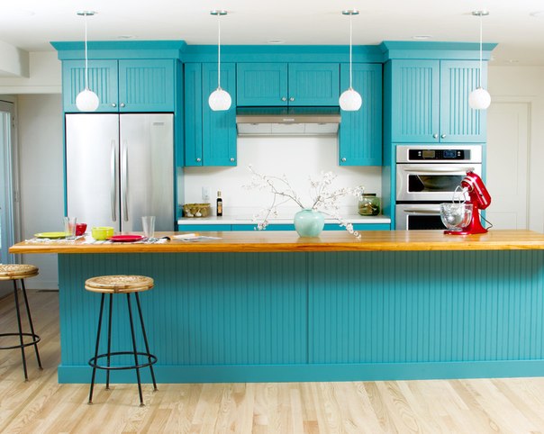
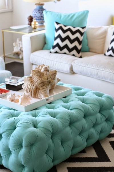
Turquoise (sea wave)
Turquoise is a borderline color that can be classified as both blue and green. Despite its coldness, it makes the room cozy and light, visually enlarges it and pushes the boundaries. Ideal for decorating kitchens with windows facing south and east.
If the area is small, the walls, rather than the furniture, are often decorated in turquoise tones. It is important to provide proper lighting: central and spot lighting is a must. Turquoise color does not awaken the appetite, but it perfectly gives the room volume and texture.

To prevent a design with light furniture from seeming faceless, bright turquoise accents are used. Textured materials look great: printed textiles, convex ceramic tiles or textured wallpaper.

Turquoise facades made to look like wood fit perfectly into an interior in a country or Provence style.

Laconic lines are perfectly complemented by an abundance of decor. Both glossy and matte surfaces are appropriate for a modern interior.
Turquoise kitchen can be combined with the following colors:
- White.
- Light gray.
- Yellow.
- Deep blue.
- Lavender.
Blue
Blue color has a calming effect, because it belongs to the short-wave spectrum. Along with green, it gives a feeling of tranquility and fits well into the interior of any area. An important nuance - like any shade of blue, blue loves good lighting. It is advisable to choose warm light lamps and provide at least 2-3 lighting options.
Blue expands space well, but you need to be careful in large rooms - they can look empty and uninhabited. You can get rid of this feeling by complementing the range with other tones.

Blue looks great both in monochrome and in textured and voluminous variations. Most often in the kitchen, the walls are decorated with this color, and warmer furniture is selected.

For reasons of practicality, saturated varieties of blue are more practical - they are not so easily soiled and give the room a certain severity.

Glossy facades make the place brighter and more interesting; they are not labor-intensive to maintain. Combined headsets also look interesting.
Blue goes with:
- White.
- Brown.
- Lemon yellow.
- Gray-pink.
- Pearly.
Green
Green is the color of peace and tranquility; it makes space more harmonious and can visually expand boundaries. The exception is dark shades, they can give a gloomy look, so they are actively diluted with light tones.
When decorating a kitchen in green, the rule applies: the richer the base tone, the calmer the auxiliary colors should be.
By the way, We wrote about this in a large article, which we dedicated to the combination of green:
For a green set with a bright apron, you should choose a neutral color for the walls and ceiling. Lighting also plays a role: rich and dark colors are not recommended for northern rooms.

Green goes well with natural textures: wood, imitation natural stone, flowers; a themed print on green surfaces is quite appropriate.

One of the most advantageous shades of green is emerald. He loves multifaceted lighting; pastel colors and black are suitable as companions.

The trend of recent seasons is an abundance of glossy surfaces. You need to be careful if the windows face south - unnecessary glare may be created.
Green goes with:
- White.
- Lemon.
- Light brown.
- Gray.
- Beige.
Light green
Juicy light green brings spring freshness. It has a beneficial effect on a person: it calms, stimulates brain activity, and gives strength. Kitchens in light green colors are decorated according to the rule: 50% light green, 50% friendly colors. If you overdo it with green, such a space will be annoying.
A set or wall is often decorated in green. A popular option is an accent wall or backsplash with a rich print. It is best to choose natural palettes to pair with light green.

Bright and acidic colors will not spoil the room if they are shaded with neutral colors. Using multi-format furniture, you can also carry out zoning.

Light green is bright and extraordinary; it goes with many things. This is a great option for using prints and voluminous textures.

A room without unnecessary accents looks harmonious and calm. This option is perfect for lovers of minimalism.
A kitchen in light green colors harmonizes with:
- White.
- Lemon.
- Violet.
- Brown.
- Beige.
Olive
Kitchen in olive is still relevant, it is sometimes called “gentle khaki”. The soft, unobtrusive color does not irritate the eye and gives a feeling of comfort. Despite all the advantages of this color, monochrome interiors are almost never found. The abundance of olive and pistachio relaxes and induces sleep, so choosing a companion is a must.
Olive facades look best on plain, light-colored surfaces. Against a background of bright red or pink, they will seem rustic. You need to carefully select variations: cold pistachio does not go well with warm palettes and vice versa.

If there is not enough light in the room, choose warm colors to go with olive - beige, brown, yellow, orange.

Olive perfectly enlarges the room. You can create a custom interior using color accents.

Olive will be combined with:
- Graphite gray.
- Brown.
- Yellow.
- Red.
- Beige.
It is not enough to choose the main color, you also need to choose the right companions for it - then the kitchen interior will be seamless and harmonious!


